Wrap text around image using CSS Float
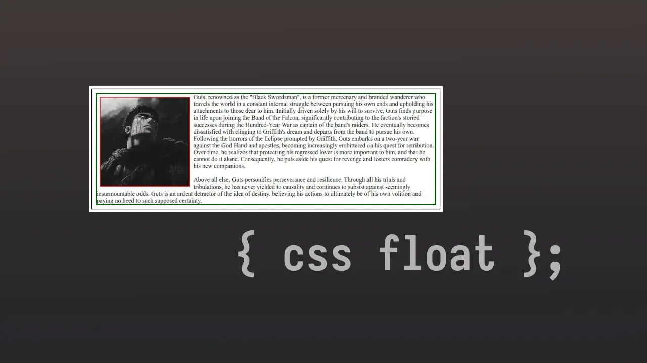
I have made made a <div class='box'> and inside it is a <img> element and <p> element with some text. <div class='box'> as a black border with 10px padding, <img> has a red border and <p> has a green border. I have also reset global (*) css margin and padding to 0.
Currently the text simply goes below the image. Default behavior of block level elements.
<html>
    <head>
        <title>CSS Float</title>
        <style>
          <!--
            I have not added the css for adding borders and all as it is very
            simple to implement, and will make the code long for no reason.
          -->
        <style>
    </head>
    <body>
        <div class="box">
            <img src="guts.jpg" width="230px" />
            <p> ... </p>
        </div>
    </body>
</html>
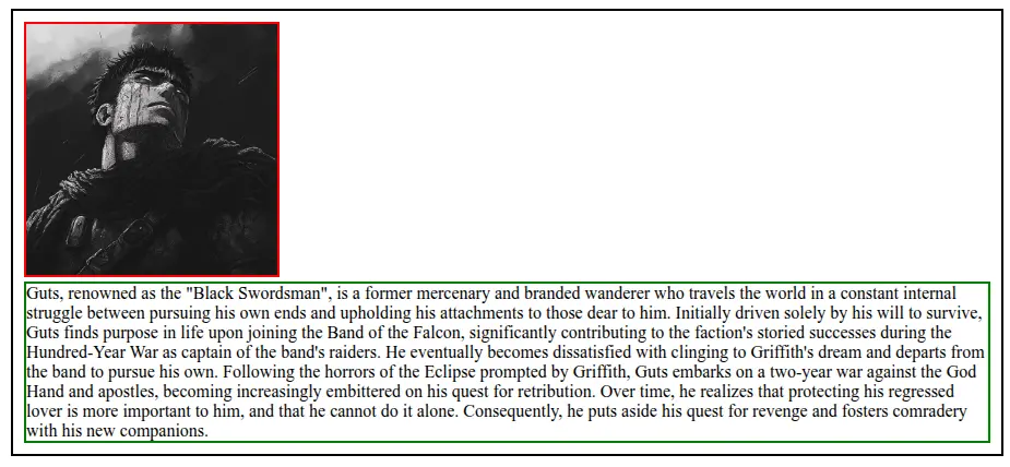
Now to make the text wrap around the image, add float: left to <img>. The image will then floats on the left, and text wraps around it.
<html>
    <head>
        <title>CSS Float</title>
        <style>
            .box img {
                float: left
            }
        <style>
    </head>
    <body>
        <div class="box">
	        <img src="guts.jpg" width="230px" />
            <p> ... </p>
        </div>
    </body>
</html>
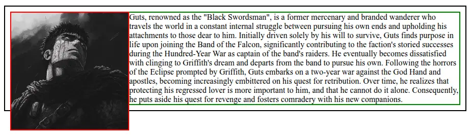
You will notice that image is actually floating inside <p>’s border. Add some margin to <img> to notice it.
<html>
    <head>
        <title>CSS Float</title>
        <style>
            .box img {
                float: left;
                margin: 10px;
            }
        <style>
    </head>
    <body>
        <div class="box">
            <img src="guts.jpg" width="230px" />
            <p> ... </p>
        </div>
    </body>
</html>
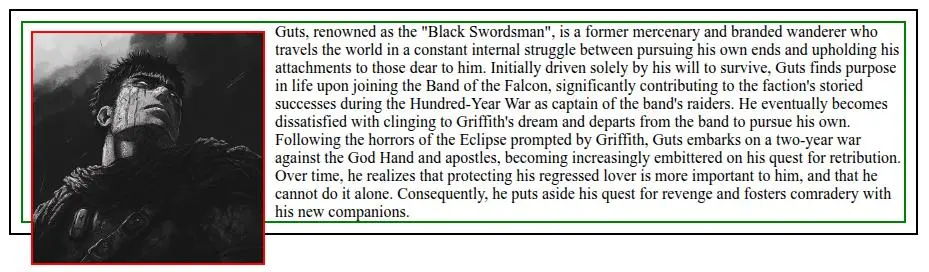
The image being big overflows <div class='box'> border. One simple way to fix it is to add display: flow-root to the <div class='box'> .
<html>
    <head>
        <title>CSS Float</title>
        <style>
            .box img {
    			float: left;
    			margin: 10px;
    		}

            .box {
                display: flow-root;
            }
        <style>
    </head>
    <body>
        <div class="box">
            <img src="guts.jpg" width="230px" />
            <p> ... </p>
        </div>
    </body>
</html>
Now add some more text to <p> to see more wrapping.
Now a days we use grid or flexbox to achieve the same.
:p