Flex direction basics
Normal behavior
Starting code -
<html>
<head>
    <title>Document</title>
    <style>
         .container {
            border: 1px solid black;
            height: 70vh;
            width: 80vw;
            margin: 10vh auto;
        }

        .item {
            width: 100px;
            height: 100px;
            background-color: blueviolet;
            border: 1px solid black;
        }
    </style>
</head>
<body>
    <div class="container">
        <div class="item">1</div>
        <div class="item">2</div>
        <div class="item">3</div>
        <div class="item">4</div>
        <div class="item">5</div>
    </div>
</body>
</html>
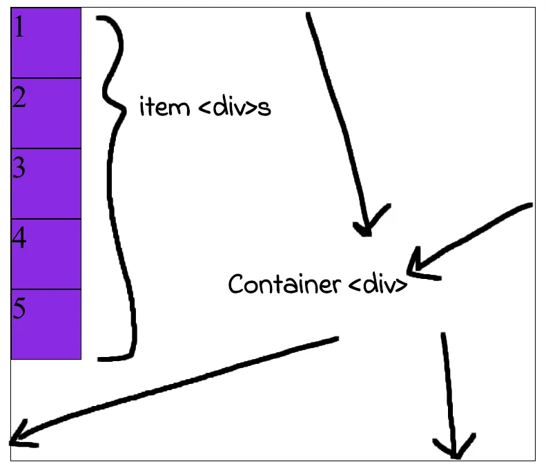
Their is a simple container <div> and inside it we have 5 item <div>s. By default <div> is a block level element so they all get stacked one after another.
Note the .container and .item styling. This is base styling used in the pictures below as well. It would be removed from later codes to reduce cluttering.
Display flex
Now we can make this container <div> a flexbox (a type of display like block and inline display).
To do this simply make display: flex for the container <div>.
.container {
    display: flex;
}
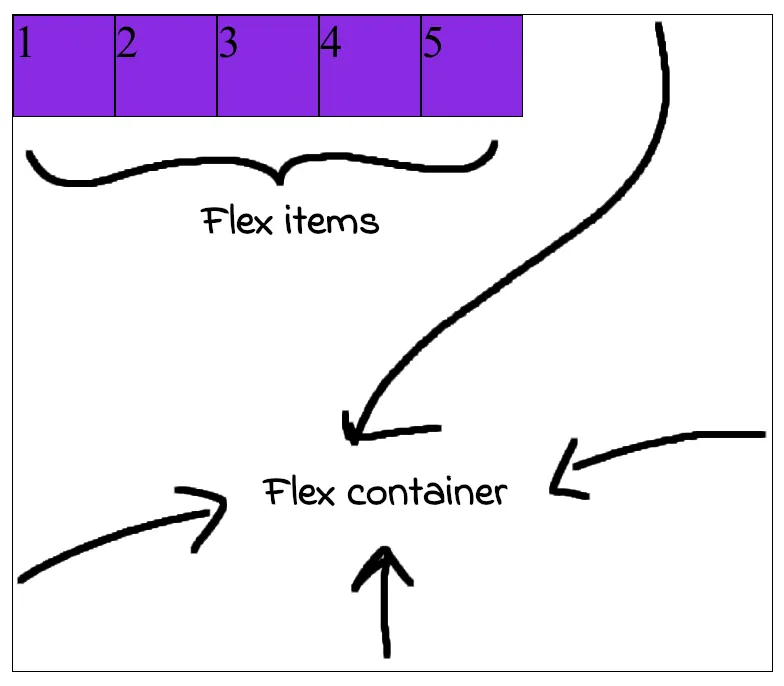
Here container <div> is now called flex container and item <div>s inside it are flex items.
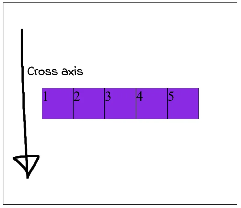
Why the items align the way they did?
When we do display: flex we can imagine two axes being created.
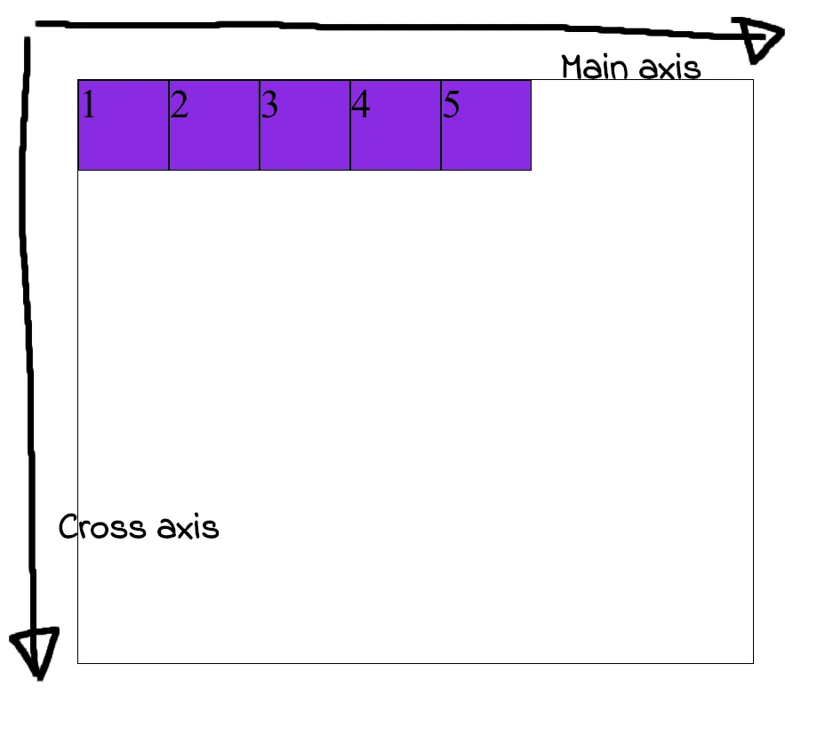
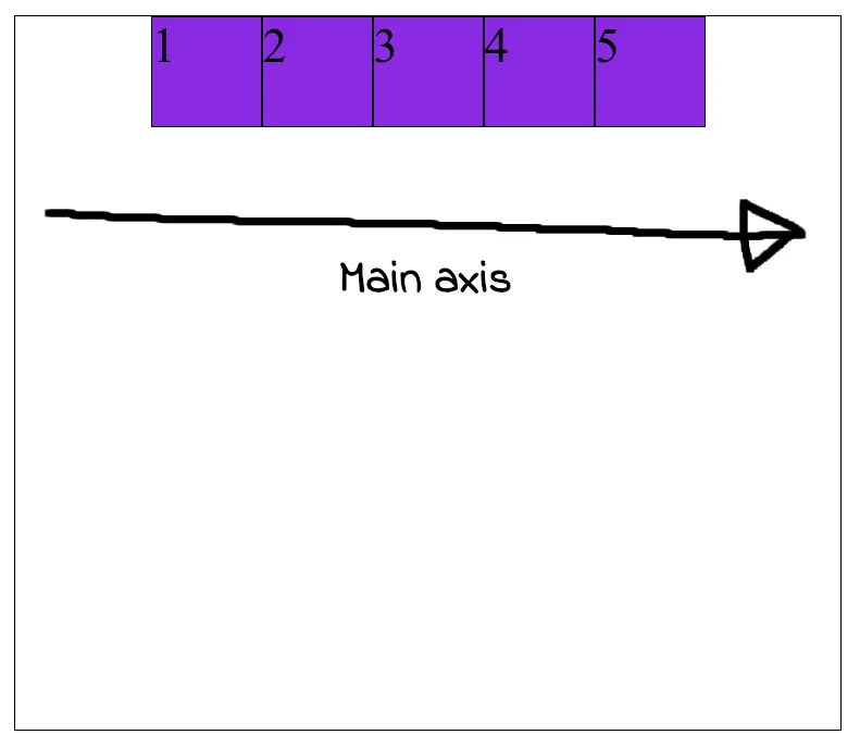
Flex items are always aligned with respect to main axis.
Also the item <divs> are aligned in order they were written, 1 to 5.
The axis perpendicular to main axis is cross axis.
Their are two flexbox properties which can be applied on the flex container.
justify-contentwhich always works on themain axis.align-itemswhich always works on thecross axis.
Now comes flex-direction. This is also a flex container property. With it we can change directions of main and cross axis. And that’s it.
Flex directions
We will use justify-content: center and align-items: center property for the coming examples.
1. Applying justify-content: center.
.container {
    justify-content: center;
}
It pushes flex items from left to right in the direction of main axis to make it center in that axis.
2. Applying align-items: center.
.container {
    justify-content: center;
    align-items: center;
}
It now pushes flex items from top to bottom to make it center in the cross axis.
Few examples
1. Flex direction made row.
.container {
    flex-direction: row;
    justify-content: center;
    align-items: center;
}
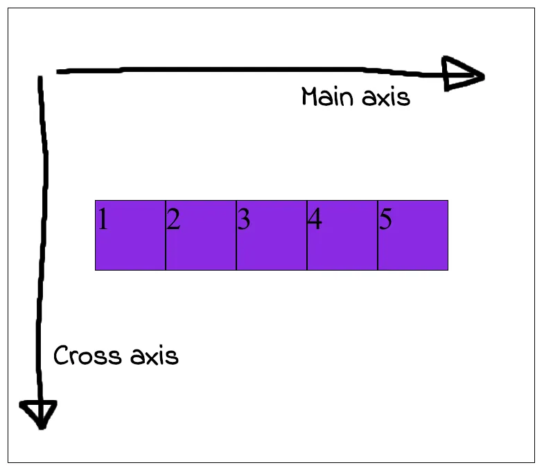
This is the default flex-direction. The item <div>s simply gets aligned on the direction of main axis from 1 to 5.
2. Flex direction made column.
.container {
    flex-direction: column;
    justify-content: center;
    align-items: center;
}
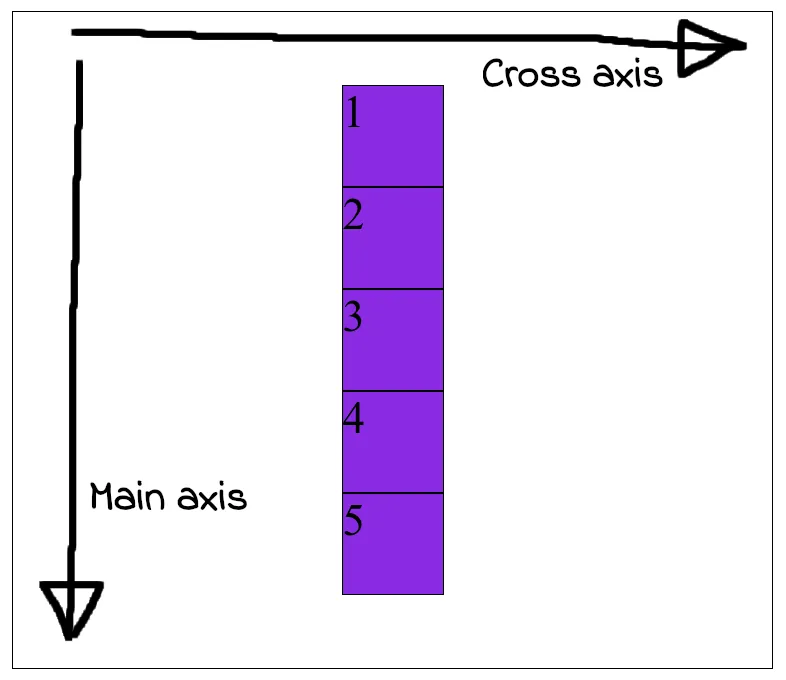
This changes the direction of main axis and cross axis. And flex items always gets aligned in the main axis.
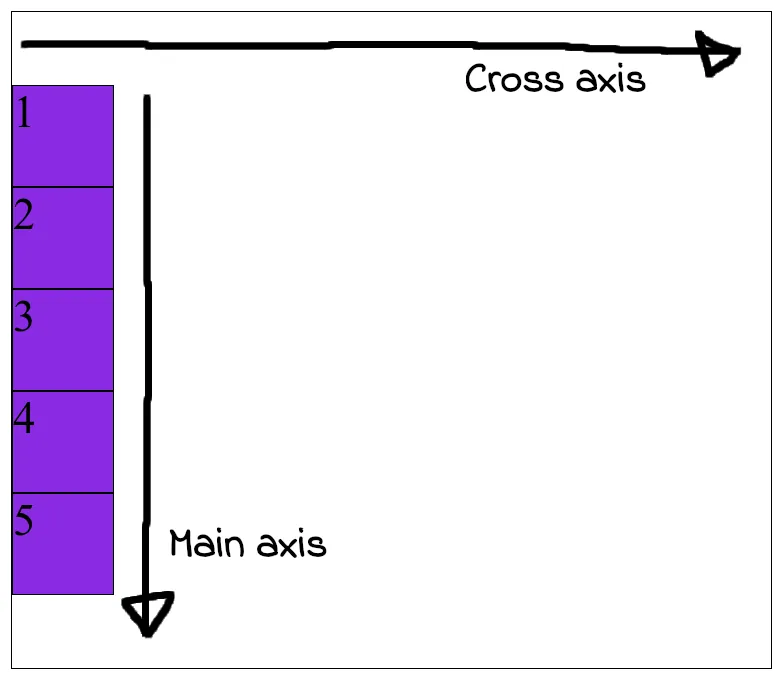
Note: Any changes made to justify-content would now take effect in the new main axis. And any changes applied to align-items would now take effect in the new cross axis.
Example: Removing align-items: center would reset flex items to left instead of top.
3. Flex direction made row-reverse.
.container {
    flex-direction: row-reverse;
    justify-content: center;
    align-items: center;
}
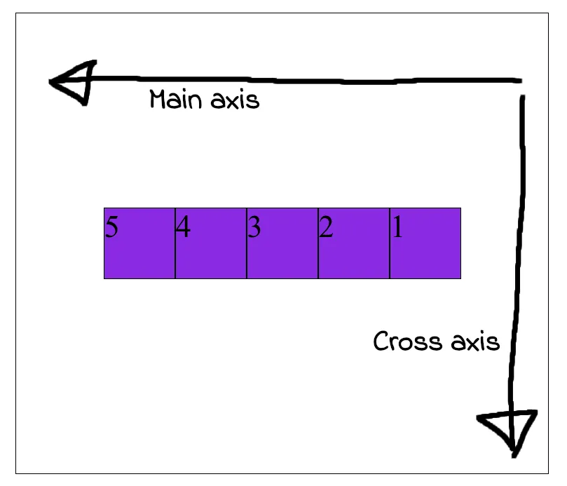
This changes the main axis direction as shown. And so item <div>s aligns from right to left this time from 1 to 5.
Or, the first item <div> which is 1 will start from tail of the main axis followed by others in order.
4. Flex direction made column-reverse.
.container {
    flex-direction: column-reverse;
    justify-content: center;
    align-items: center;
}
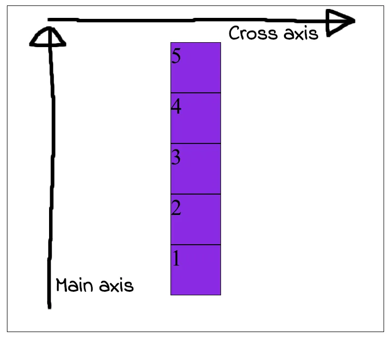
The main axis now runs bottom to top and so the flex-items gets aligned in the same way.
Their are many other options for flex-direction, justify-content and align-items which follows this same principal.
End
🦖